Empowering Rural Communities Through Digital Innovation

Building Hope in 48 Hours
Hours 0–6: The Starting Line
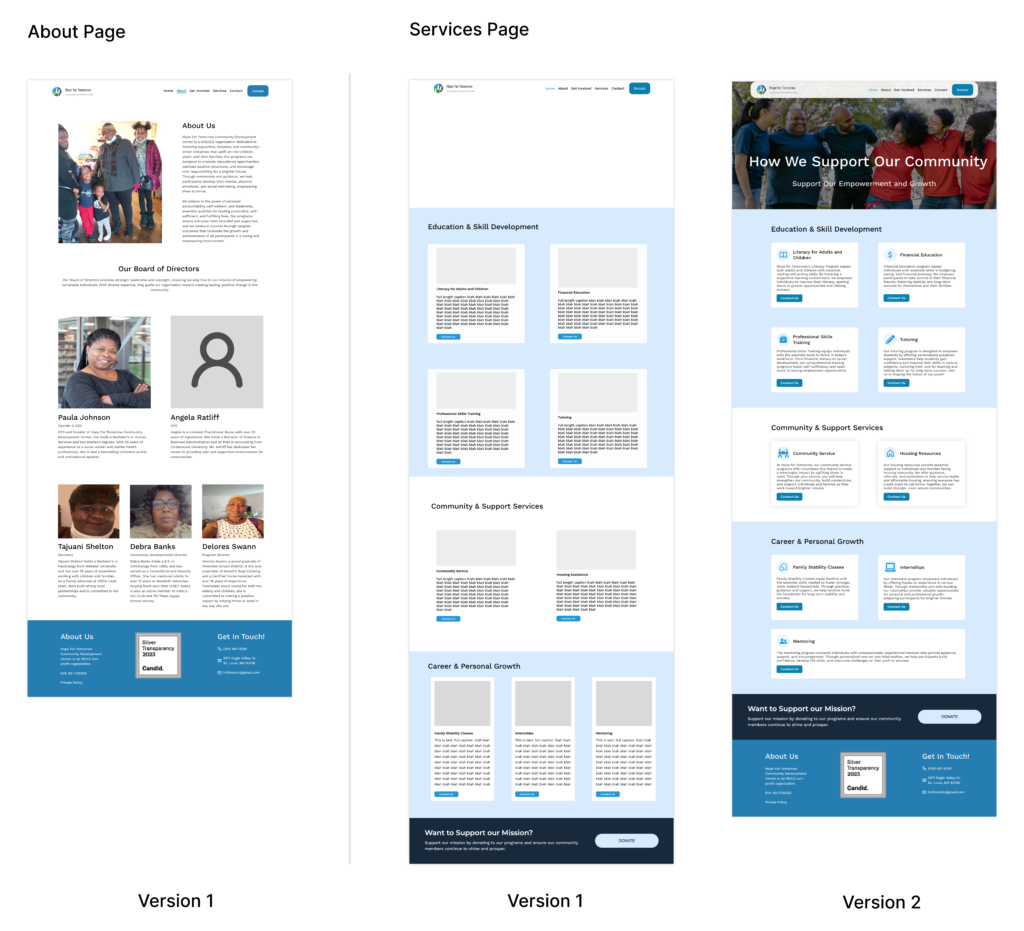
We began with brainstorming sessions, outlining the nonprofit’s goals and the essential features the website needed. I quickly sketched out wireframes to establish the foundation for each page, ensuring the structure aligned with user needs and accessibility standards.

Hours 7–15: Laying the Foundation
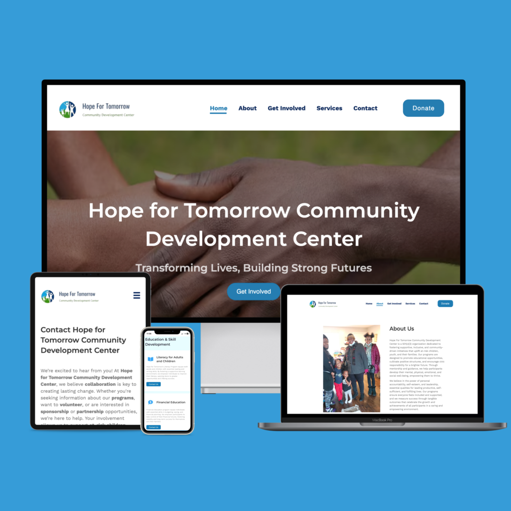
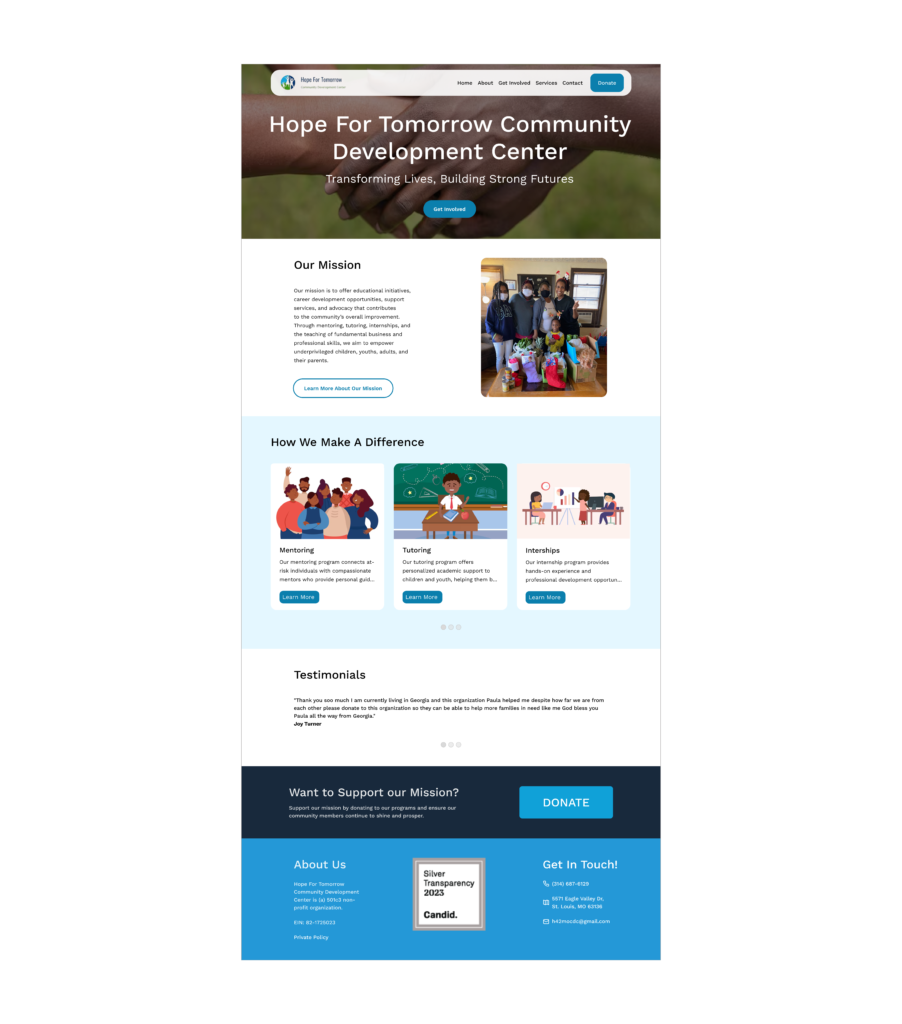
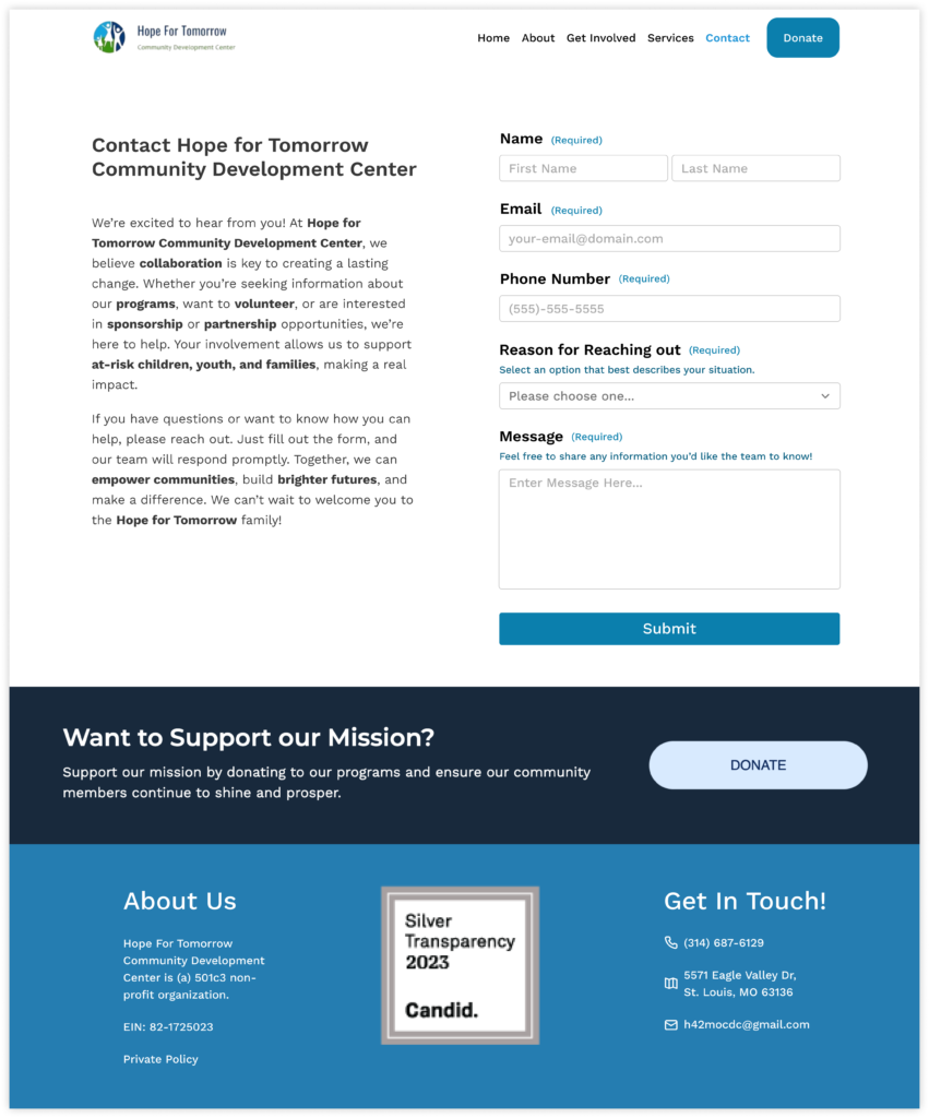
With the wireframes in place, I refined the designs to balance functionality and aesthetics. The homepage was designed to make an immediate impact, showcasing key sections like upcoming events and a simple navigation menu. Each page—whether the About, Contact, or Services—was carefully structured to reflect the nonprofit’s mission and resonate with its audience.
During this phase, collaboration was critical. I worked closely with my team to finalize the content strategy and align on visual priorities, setting the stage for development.

Hours 16–30: Building Under Pressure
The design work transitioned into development as the WordPress developer began implementing my designs. This phase was a whirlwind of communication and iteration, as we worked together to ensure every detail translated seamlessly from concept to code.
Challenges emerged, such as addressing accessibility concerns like button color contrast and adjusting the text size on the contact form. I also noticed that some designs weren’t implemented as intended, prompting me to review and guide the developer in real-time.
Despite the pressure, our team maintained momentum. Quick check-ins and constant updates helped us overcome hurdles and keep everything on track.

Hours 31–42: Tuning and Feedback
As the website started coming together, we shifted our focus to polishing the details. This included adding the finishing touches to page layouts, refining the visual hierarchy, and ensuring consistency across all pages.
We also received feedback during this phase, which highlighted areas for improvement, such as blurry images on the Board of Directors page and repetitive "Learn More" buttons on the homepage. I encouraged the team to see this feedback as an opportunity, reminding everyone that we had successfully built five pages with only a few minor adjustments needed.
